The lens is the only component of an eyewear design that affects perception directly. The frame sits on the face; the lens sits between the eye and the world. Everything the wearer sees is filtered through it. This is a remarkable design situation — the object modifies not just appearance but experience.
This dual function — lens as optical instrument and lens as design element — has been variously prioritized across the history of eyewear design. The functional tradition emphasizes the optical properties: transmission percentage, UV filtering, color rendering accuracy. The fashion tradition emphasizes the aesthetic properties: the color, the tint, the surface quality. The most interesting contemporary work treats these not as competing priorities but as inseparable aspects of a unified design object.
What color does to the world
Every lens tint is a world-model. Gray is the most neutral — it reduces overall brightness without significantly altering color relationships. The world seen through a gray lens is the world with the volume turned down.
Amber changes the world more substantially. It filters blue light, which shifts the perceived color palette toward the warm end of the spectrum and increases contrast. The world seen through amber lenses is warmer, more textured, slightly more three-dimensional. It is not the world more accurately; it is the world with specific visual properties enhanced and others suppressed.
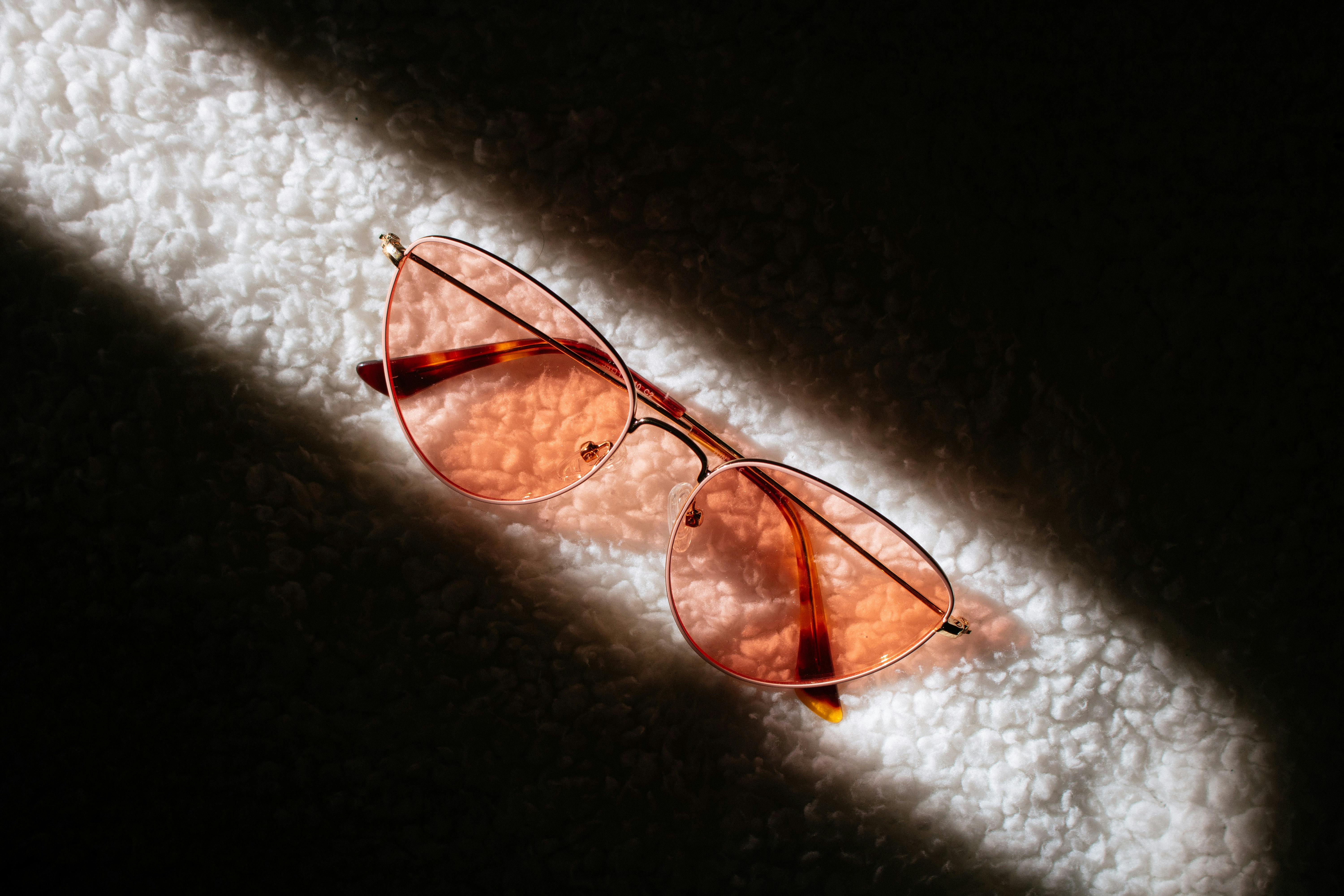
Rose does something different from both. It reduces the weight of the visible spectrum in the 520-570nm range (green to yellow) while maintaining blue and red. The effect is a subtle shift in chromatic relationships that many people find easier on the eyes over extended periods. The world seen through rose lenses has a quality that is hard to name but immediately perceptible — something between warmth and clarity that neutral gray does not produce.
Each tint is a designed perception. The designer who chooses a lens color is choosing what version of the world the wearer experiences. This is a design decision with no parallel in other accessory categories.
The historical treatment
The history of lens color in eyewear design can be read as a negotiation between optical function and aesthetic ambition.
The earliest tinted lenses were functional. Green glass, which reduces glare while maintaining reasonable color accuracy, was the standard for most of the nineteenth and early twentieth centuries. Brown and amber entered as alternatives with enhanced contrast properties. Gray became dominant in the mid-twentieth century as color accuracy became valued over contrast enhancement.
The fashion treatment of lens color emerged most visibly in the 1960s and 1970s, when tinted lenses moved from being a modification of functional eyewear into a deliberate aesthetic choice. The colored lenses of the late 1960s — blues, greens, warm ambers — were chosen for their visual effect rather than their optical properties. The world seen through a blue lens was more interesting than the world seen clearly.
This period is when the lens-as-filter logic was most explicitly foregrounded. Wearing a colored lens was a statement about wanting to see the world in a particular way. The color was not incidental to the design; it was the design.
The retreat and return
The 1980s and 1990s saw a partial retreat from expressive lens color in favor of neutral, technically oriented tints. The sport performance aesthetic that dominated this period prioritized optical clarity and functional correctness. Lens colors were chosen for their performance properties — contrast enhancement for specific sports, true-color rendering for activities requiring accurate visual judgment.
The current moment is in the return from this retreat. Lens color is being treated expressively again, but with an awareness of the optical properties that the 1960s-1970s aesthetic play often lacked. The most interesting contemporary lens work is simultaneously aware of what the color does optically and what it communicates aesthetically.
A frame with a pale rose lens is making a statement. It is also giving the wearer a slightly different version of the world. Both of these are true, and neither cancels the other.
The material dimension
Lens color interacts with the frame material in ways that affect the overall design. This is more complex than color matching. It involves the transmission properties of different lens materials, the way different frame colors and textures affect the perceived color of the lens, and the optical relationship between frame geometry and lens tint.
A deep amber lens in a thin wire frame reads differently from the same lens in a heavy acetate frame. The wire frame makes the lens more visually prominent — the lens is the dominant element, and the tint carries more design weight. The heavy acetate frame distributes the visual weight more evenly between frame and lens.
This means lens color decisions are inseparable from frame design decisions. A lens that works in one frame context may not work in another, even with identical optical properties. The design has to be considered as a whole.
The integrated approach
The approach to lens color that produces the most coherent design work treats the lens and frame as a single unified object rather than two components that need to be coordinated.
This means starting with a question about what kind of experience the design is trying to create — both perceptually (what world does the wearer inhabit through this lens) and aesthetically (what does the object communicate when worn) — and working backward to the specific choices that produce that experience.
A pale, barely-there tint that gives the world a slight warmth while appearing nearly clear from the outside communicates something different from an opaque amber that visibly colors the world. Both are valid design positions. The work is in understanding what each position means and making the choice deliberately rather than residually — not defaulting to gray because gray is safe, but choosing gray because the design logic demands the most neutral possible filter, or avoiding gray because the design calls for the world to be experienced in a specific chromatic register.
The lens is where eyewear design becomes most intimate. It is the design that gets between the wearer and everything they see. That intimacy is a responsibility that the best eyewear design takes seriously.